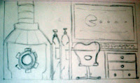
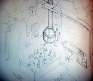
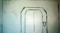
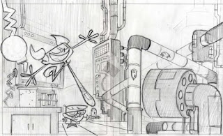
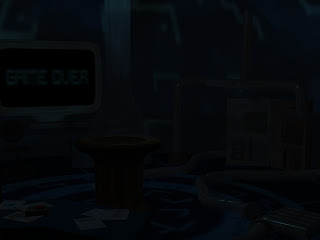
So here is the storyboards for my animation that i have been working on.
Well as you can see the storyboards show a clear sense of direction of what will be happening throughout the animation. As you can see i had a long thought on how it should come along and simply described what I intended to do in each scene. Although i am well aware storyboards are not always what the finished article will look like and i have used my storyboards as a guide when it comes to building and working upon my scenes.
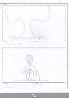
Well i had the storyboard reviewed and it was agreed that it was far too long for the project considering we don't have the longest amount of time to work upon a animated piece if i was to follow the storyboard. It work out the first piece was in the 50 seconds mark woops my bad like usual i got carried away and went over the top.
So taking this on board i have modified and changed the story and some of the scenes so that it works better overall, but this is still part of the drafting stage. So if you can continue towards the bottom of the page you can see the first animatic.
My first animatic after having done this i have decided to work upon my storyboards some more so i got a clearer direction what is going on in my scenes. This time i will have a clearer idea of the time each scene will be. So ill post my storyboards with descriptions and camera settings and scenes next to show some development in my work.
Camera will be focused at the completly away from the character we will be introduced to the layout first. Camera will be focused near the door to begin with then we will have it spiral towards the next view. This opening scene will be around 6-8 seconds long and its important to get them right due to the fact this opening scene will set the scene for what's to come.
The side view of the character typing viciously,
camera will slowly move in towards character but must always avoid showing the computer screen. 2-3 seconds long it will be.
This is the table slam scene it important to nail this scene cause it really will set the mood. a slight camera shake when the fist hits will be require to give it that bit of energy that is needed. 1-2 seconds long after all a fist slam isn't really gonna be long.
ill have this 2-d piece playing over the computer screen. simple camera hold it still not too long a scene 3-4 seconds long.
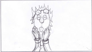 Final scene although there are a few arguments weather are not the game over scene should have this to catch the audience off guard.
What is my story well as you can see we have a scientist we are in the lab we are introduced to chemicals gizmo's and a variety of gadgets. the camera moves along we see our character typing away presumingly on his next big experiment. you see a vicious slam...why, gameover, our character has been playing games its meant to catch the audience off guard. we then have him in all of his frustrations slam his head against the table.
So all and all its a bit of fun this story, this scenerio have some fun.
So all and all its a bit of fun this story, this scenerio have some fun.
Another new animatic has been added have a look at the progress when compared to the earlier one.
Storyboarding with renders sorted out the camera for my animation for new each image thats where the camera goes except the first 5 we have the camera mover gradually till we get that scene.
the rest are instant camera changes.
now the camera is in place its time to animate!!!!
my first test for animation however i still feel as thought there is something missing so ill be working on that shortly.
Sadly when rendered using a compression i lose a lot of the darkness and brightens the scene so i am hoping that is not held against me.
As you can see pac man is no longer part of the project he just didn't look right as he went across the scene.
so i scrapped the idea and shortened the scene.
but here is the final finished render
here is also a alternative render with text popping off during impact but that got cut


